pascale-portfolio
final project - evictions in allegheny county - part 3
The real final project is here! This is just a reflection on the process!
Summary
Part 1 - I identified my data sources and began to sketch out what the story could be.
Part 2 - I dug further into the data sources that were available and showed my draft visualizations to some patient test subjects!
Part 3 - I created a story with graphics and data visualizations about evictions in Allegheny County, how they happen, who they happen to, and what we can do about it.
Process
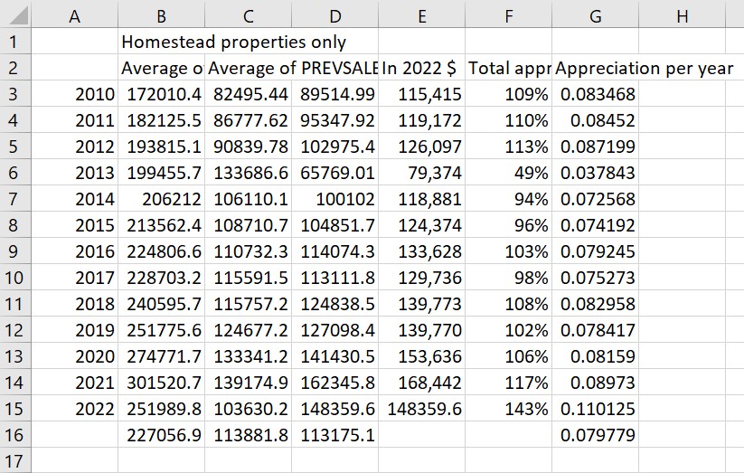
After I storyboarded with my test subjects, I had a lot of feedback to sort through, and then it was time to make the final versions of the visualizations and decide what order to put them all in. The most insightful information that I shared with my test users was all about money - specifically they were interested in property values and expenditures, as well as eviction filings. Naturally this was the most difficult to work with! The data that I ended up using came from:
(1) the Bureau of Labor Statistics, which publishes expenditure data by income every year.
(2) the Create Lab at CMU. Anne Wright sent me data and she was so helpful. I had the datasets from a Google Sheet that the Create Lab pulls from to report up to date eviction counts to the Eviction Lab, and she also sent me all of the evictions in Allegheny County from 2008 to 2018 in an Excel sheet. This dataset included claim amounts, how the case was decided, the plaintiff and defendant, the dates, but only the zip codes, not the property addresses. It was messy but once I deduplicated it, it was fascinating. I made a pivot table with it that showed me useful trends - I found how many times landlords appeared in eviction filings, tenants who had been evicted multiple times, and the claim amounts.
(3) WPRDC, which provides a property assessments dataset that includes most recent sale price, previous sale price, dates, addresses, and a homestead tax flag for every property in the county. I cut it down to only include properties that had sold since 2010, and homestead properties, and the 10 zip codes with the most evictions just to make it more manageable, but once I started working with pivot tables I was able to go back to the bigger dataset and work with all of the county’s properties. I wanted to learn how much equity landlords gain from their properties. Knowing about comparable sale prices tells us about the equity in all properties, even if they’re not sold.
(4) PA.211counts.org, which you can filter by county and dates to discover why people contact 211. This was a good proxy for need because people call 211 for help.
Once I had these datasets cleaned up and providing me with useful insights, I put them in flourish to make my visualizations. One that I cut was a graph of the average number of evictions that a single landlord files because it was too confusing to look at. I replaced it with a bar graph about expenditures and just wrote out some of the property value numbers that I calculated in excel.
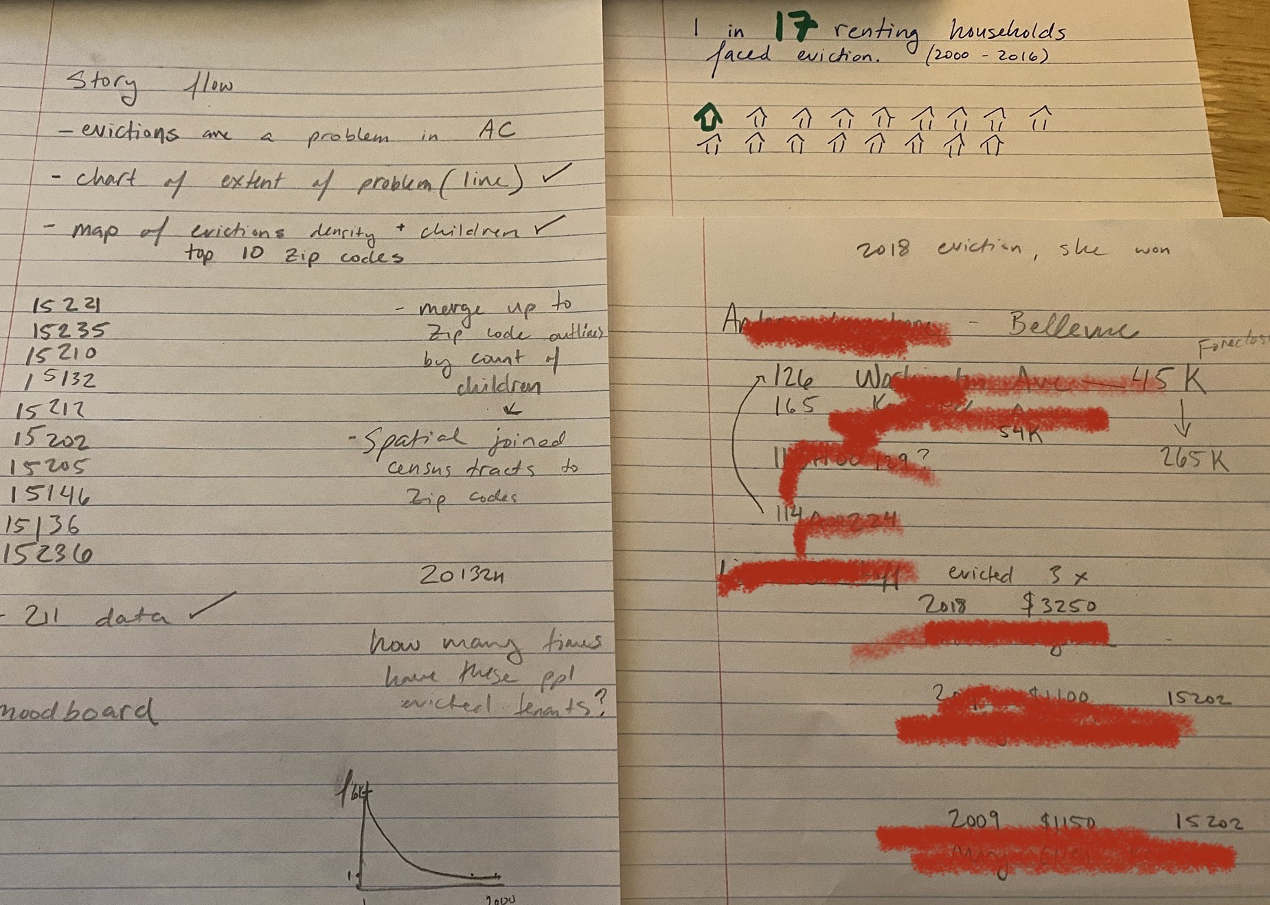
Then I took stock of what I had and mapped out a story flow (has some redacted lines of personal info beause I was going to try to map out one particular tenant’s journey through multiple evictions but that didn’t really work):
I also decided that I needed more for my call to action, so I looked up Philly’s eviction diversion program outcomes and made a Sankey diagram.
Map Failures
Failure is part of the process… I wanted to use maps to talk about the geographic inequity of eviction. I identified the zip codes that had the most evictions by looking at the Eviction Lab’s website, and then I decide to see how many children are in those zip codes, and how many people of color, and how much poverty. The problem with this was that I only had children, poverty, and race data by census tract, so I had to do a spatial join to get it for zip code boundaries, and I just couldn’t get this join to work for the longest time.
I also wanted to compare evictions to the history of redlining, but the correlation is not that visually striking. Here are just a few of my failed maps:
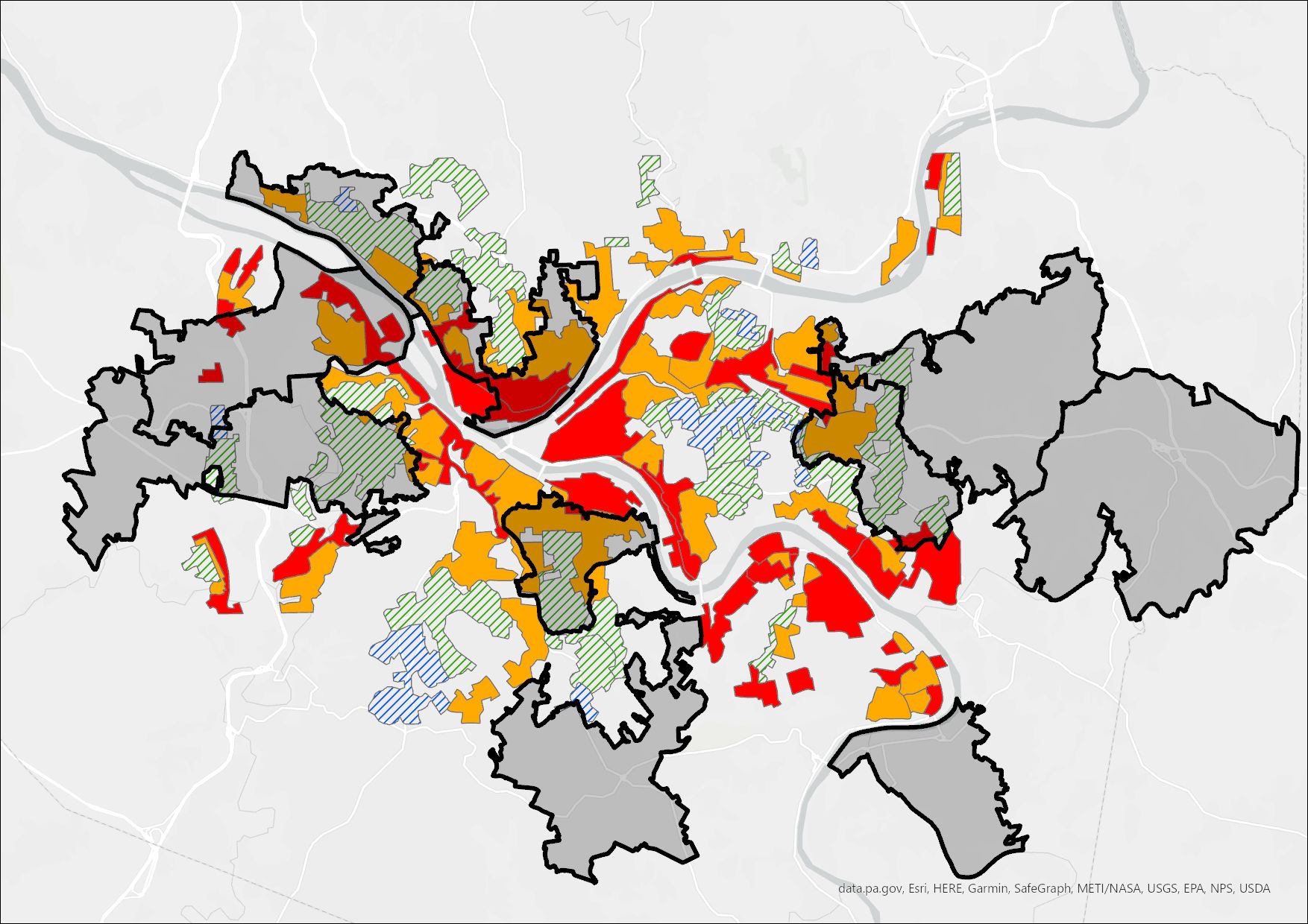
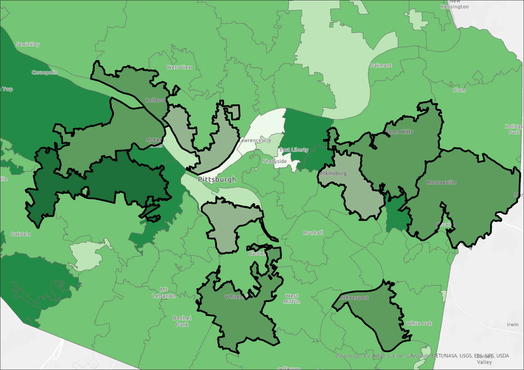
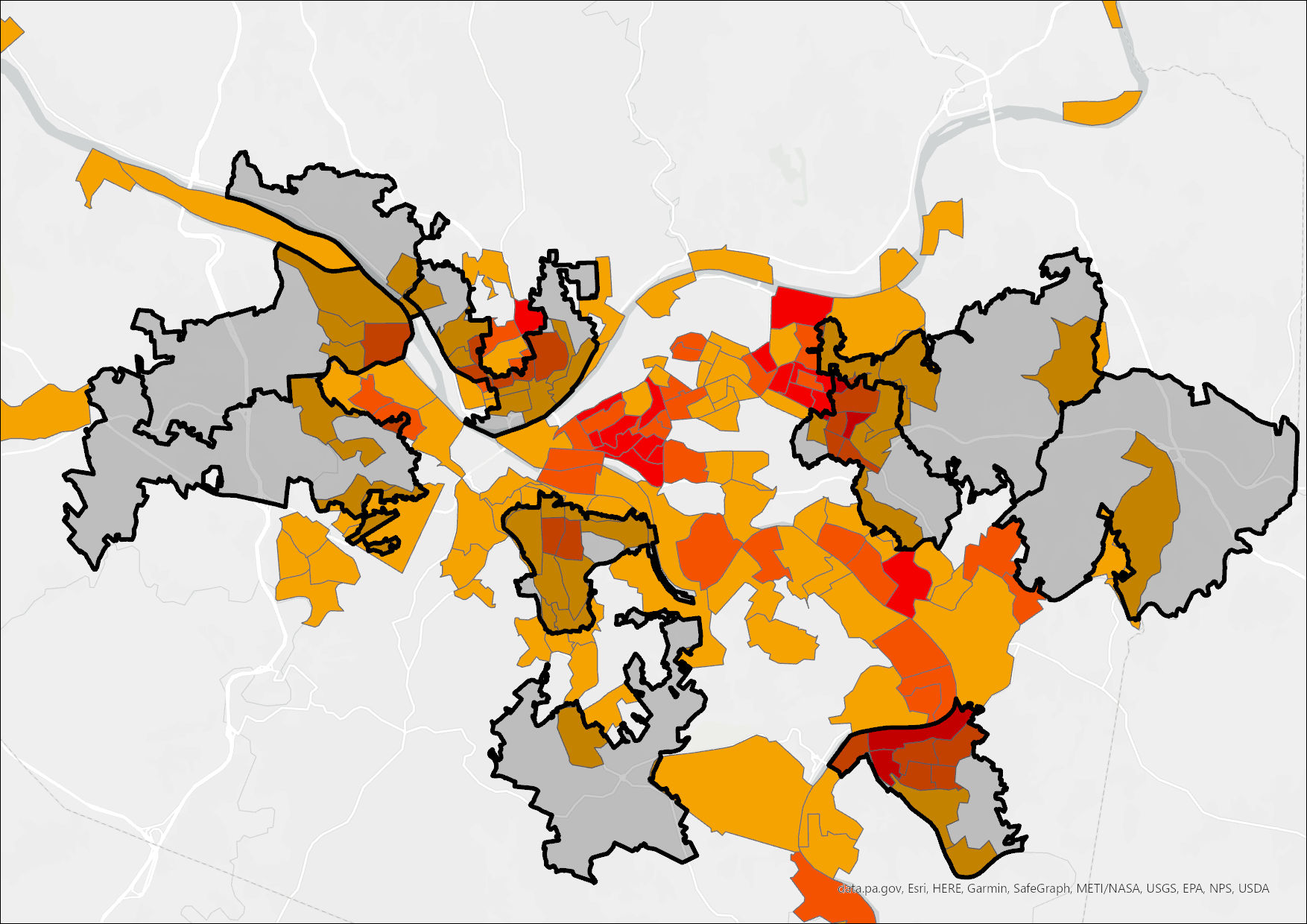
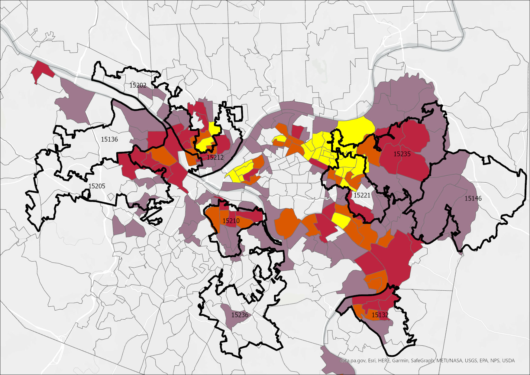
Once I figured out what was up with all of my joins (I realized I was joining 2020 census data to 2016 tracts, so there were lots of holes), my users did not respond to most of the maps anyway, so I only ended up using 2 of them.
Polishing and Reflecting
Now it was time to write the copy for the story, put it in Shorthand, and tinker with formatting. Then I sent it to my original group of test subjects for their final thoughts, and found stock photos. Here’s the finished product. I like how it came out.
In closing, I care about evictions and housing insecurity, and this project was a great opportunity for me to practice working with some messy datasets, make some maps, and to be creative. I learned how to communicate about something that I care about / find interesting that others may not know they should care about.