pascale-portfolio
final project - evictions in Allegheny County - part two - draft of storyboard, user feedback
part 1 here
part 3 here
intro
(this is the same as part one)
The lack of housing affordability and access to safe, quality housing in America are problems of an astounding scale, and their negative impacts bleed into so many areas of life - healthcare, food access, schools, infrastructure, work - there’s a reason that “Housing First” has become a refrain in social services. More information about Housing First can be found here with the National Alliance to End Homelessness. Ensuring that people have access to safe and stable housing should be the first step, and it has powerful downstream effects for our other services. For example, giving people housing can save tens of thousands of dollars in emergency room costs per year. (Sturtevant & Viveiros, 2016)
Evictions are one way that people can be housing insecure, and even when evictions don’t lead to homelessness, eviction itself is a traumatic experience that has many negative impacts. The story my project will tell is about evictions in Allegheny County, and how they correlate with rent and property values increasing, how they impact other social services, and how landlords are more likely to evict children and Black people.
visualizations and sketches
The story will begin with a line chart of evictions in Allegheny County over time.
Property owners who have sold houses in the Allegheny County zip codes that have the most eviction filings have enjoyed an average appreciation of 137% since 2010.
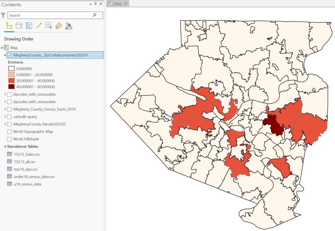
(Map of Zips 15221, 15235, 15146, 15206, 15202, 15205, 15212, 15236, 15025, 15210.)
The average landlord who filed for eviction in these zip codes did so five times between 2009 and 2018. This is certainly an undercount, as many of them own properties in different names and LLCs.
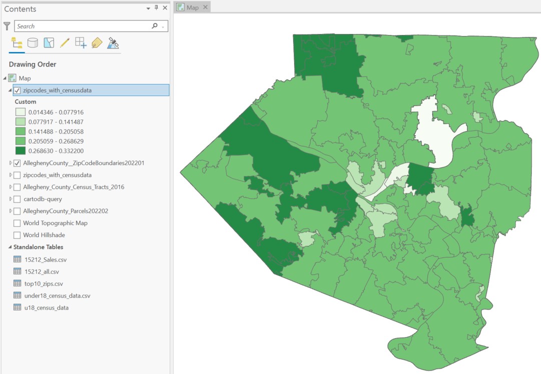
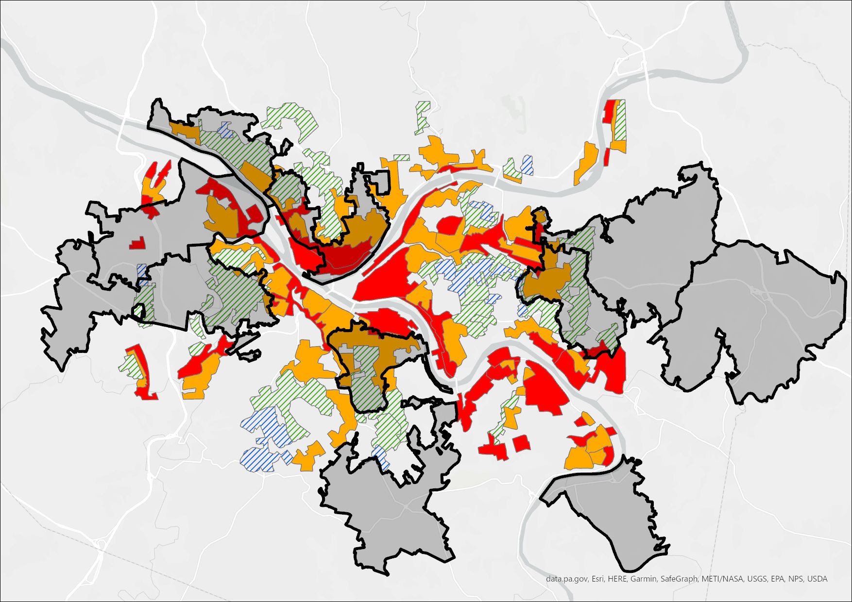
*Discussion here of redlining, concentrations of poverty, and evictions
 *Must write a narrative about the impacts of eviction on children.
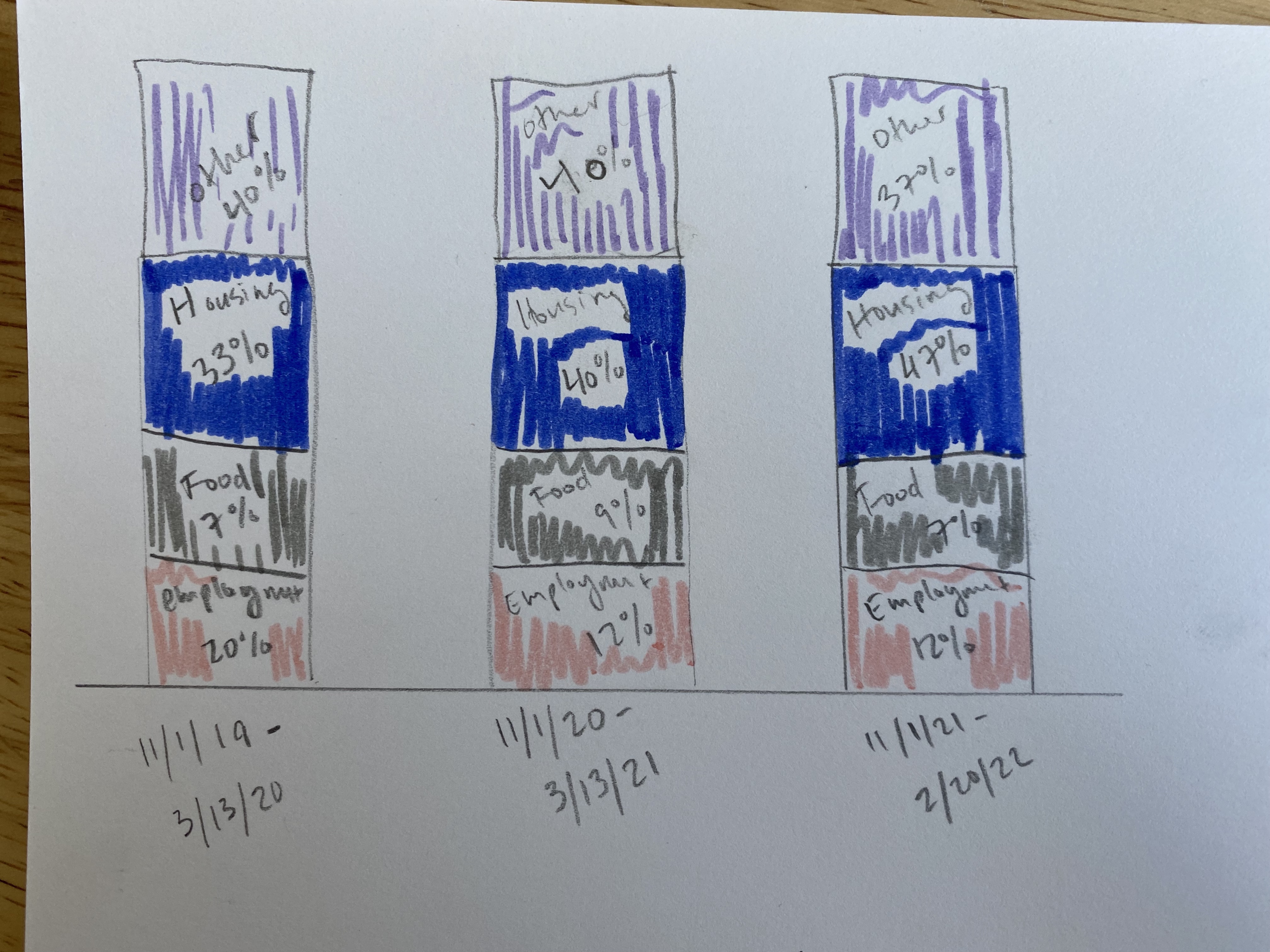
I will end the story with some stacked bars that show 211 calls over time. This is a great proxy for need, because 211 is the phone line people can call to get immediate help with social services.
The call to action will be to create a push for a comprehensive eviction diversion program, like the one that exists in Philadelphia, which requires landlords to participate in mediation before evicting their tenants. *Must find data about eviction outcomes in Philly!
how many people get evicted?
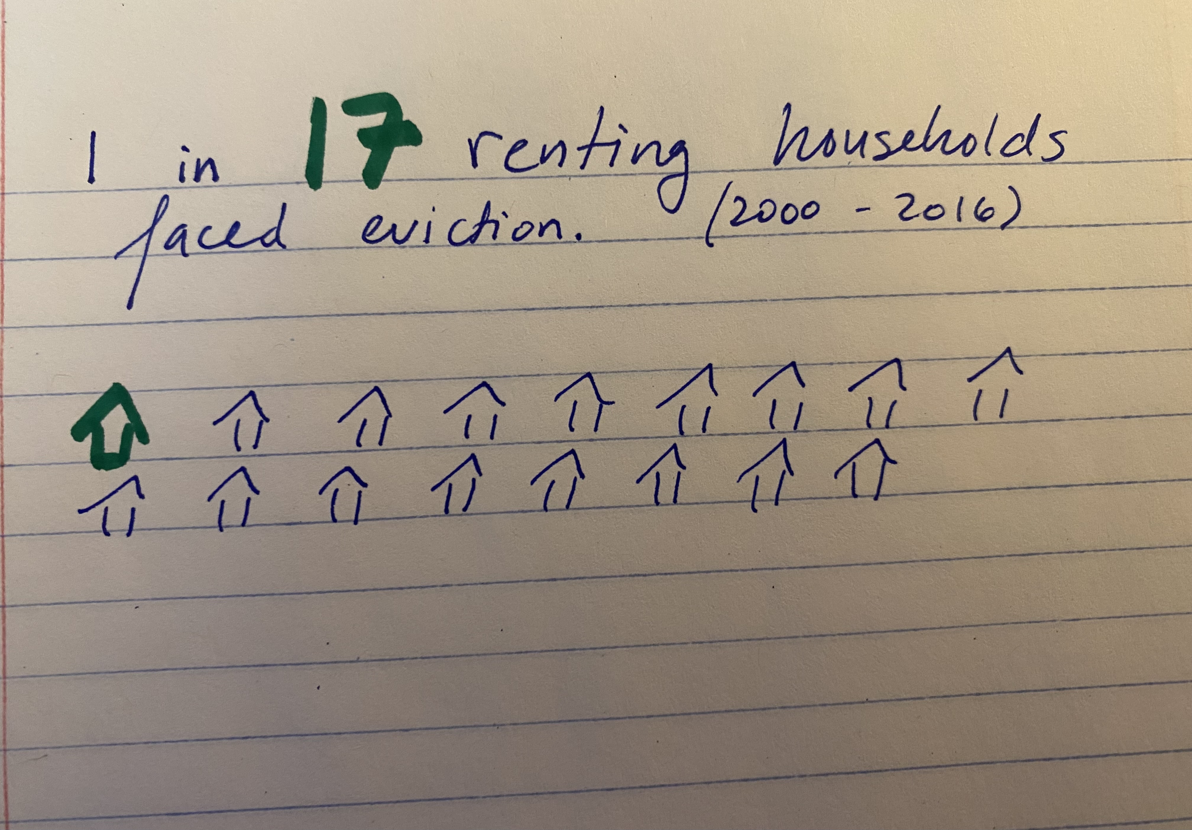
“As the figures above show, our current data suggest there was roughly 1 eviction filing for every 17 renter households between 2000 and 2016. Approximately 1 in 40 renter households were evicted over this period. To put these numbers into perspective, at the peak of the financial crisis in 2010, estimates suggest slightly over one million foreclosures were completed nationally. By comparison, we see almost a million evictions against tenants every single year.” (Eviction Lab) source link
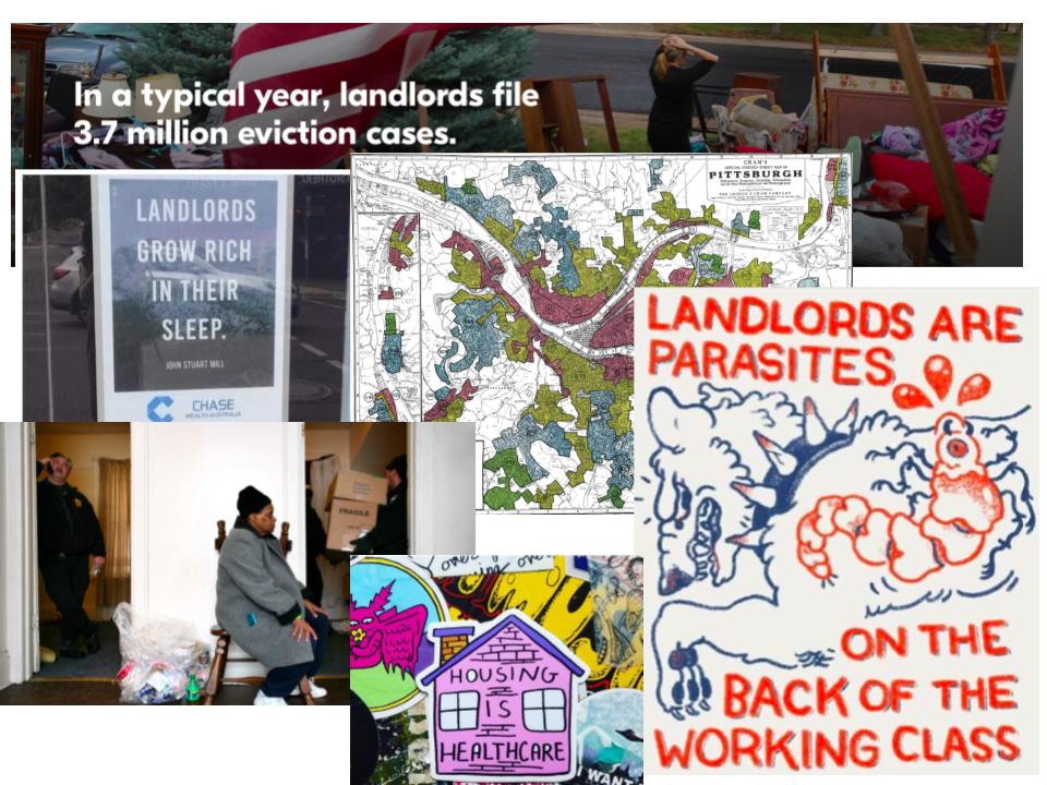
moodboard
feedback
a. Deciding who to attempt to reach with this story was difficult. I know that people who work in housing or housing advocates will enjoy learning this information, but I also think it’s an opportunity to educate the general public. I ultimately will hope that both groups will get something out of it, but anticipate it resonating more with those who are already geared towards caring about housing issues.
b. I spoke to 5 people total: 2 from Pittsburgh, 2 in New York, and 1 in Richmond, VA. I selected a variety of ages and homeowner/renter statuses, as well as a variety of political orientations. I think that by incorporating homeowners with and without mortgages, I am capturing people who can and cannot feasibly be evicted. Because I am making a case against landlords I felt it was important to test it on those who might be sympathetic to either side. I intend to also get feedback from someone who works in the affordable housing field but our availability did not line up in time for this due date. I wish I had found someone who had actually faced eviction.
c. Here are the questions I asked:
“Do people unfamiliar with data visualization and/or evictions understand what the site is about?
What is confusing, if anything?
What problems are most severe?
Is there anything you particularly like about it?
The visualizations are drafts/screenshots/hand drawn so that I don’t spend a bunch of time on something that will be cut so keep that in mind.
Particularly helpful would be commentary on your emotional reaction, and if the gist of any of the graphs is especially confusing.”
d. Interview findings:
Person A: 60s, homeowner, mortgage, retired
137% seems to be in a vacuum. What is overall appreciation?
Maps assume too much local knowledge. I don’t know which communities are represented.
I don’t understand evictions/count chart
Person B: 60s, homeowner, no mortgage, architect
I would try to make the gross evictions % relate to some other stat-% of renters or something. Also explain drop in 2020/1 (although we know why.)
Any stats to project for current situation?
You show price appreciation in highest eviction neighborhoods but what is the appreciation in other zip codes? If it doesn’t support the thesis maybe get rid of it?
The evictions per landlord is important but this line graph doesn’t clearly tell the story. You say “average” but can’t find that on the graph.
It is unclear what the last two maps are showing. The colorization is a great tool but showing the all GIS input checkboxes down to the 4 digit precision is confusing.
Person C: Late 20s, homeowner, mortgage, tech job
I can’t tell what you’re expressing w the appreciation and eviction count stats, like duh landlords profit off poor people but you should be more explicit.
I hope the moodboard stays.
Person D: Late 20s, homeowner, mortgage, consultant
This sentence confuses me: Property owners who have sold houses in the Allegheny County zip codes that have the most eviction filings have enjoyed an average appreciation of 137% since 2010.
I’m pretty confused about what the map is showing.
And the two maps that follow (the green and HOLC grade one) need captions/some interpretative text. I’m having a hard time seeing what they refer to. I really love the hand drawn personal budget graph and think that will look great and be really interesting once you make it in a code program.
Overall! I really like it. I think adding a sentence about “this problem is worse in some zip codes than others: etc” will help frame those 3 maps a bit better so we know what we’re looking at.
I like the 1/17 figure a lot and wonder if you would like to move it to the top of the document.
Person E: Late 20s, renter, city government employee
Love the mood board.
I think this is a super compelling project and the last statistic is gutting - even as someone familiar with this *@%# - I had no idea evictions were that frequent.
The one visualization that was kinda confusing to me was this one [# of evictions per landlord graph]
Just when I was feeling some kindness towards my landlord!
e. Between the feedback I received from my contacts and the feedback I got in class I am feeling pretty well equipped to improve my visualizations. The main tasks I am going to do are as follows:
- Reformat the maps and add titles, clarity on what they are depicting
- Redesign the chart of evictions by landlord
- Reorder the story to talk about the quantity of evictions at the top
- Do more digging to uncover the dollar amount of typical eviction judgements
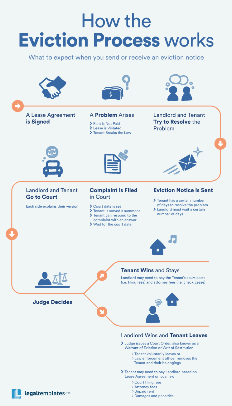
- More context around what the eviction process looks like for tenants, perhaps some data about personal budgets for low income renters
- Clarify the call to action and enhance the policy suggestion with impact data from where it’s been implemented
- Incorporate the design elements of the mood board
- Generally continue to test and refine different visualizations.
