pascale-portfolio
final project - evictions in Allegheny County - part one
part 2 here
part 3 here
intro
The lack of housing affordability and access to safe, quality housing in America are problems of an astounding scale, and their negative impacts bleed into so many areas of life - healthcare, food access, schools, infrastructure, work - there’s a reason that “Housing First” has become a refrain in social services. More information about Housing First can be found here with the National Alliance to End Homelessness. Ensuring that people have access to safe and stable housing should be the first step, and it has powerful downstream effects for our other services. For example, giving people housing can save tens of thousands of dollars in emergency room costs per year. (Sturtevant & Viveiros, 2016)
Evictions are one way that people can be housing insecure, and even when evictions don’t lead to homelessness, eviction itself is a traumatic experience that has many negative impacts. The story my project will tell is about evictions in Allegheny County, and how they correlate with rent and property values increasing, how they impact other social services, and how landlords are more likely to evict children and Black people.
visualizations and sketches
The story will begin with a line chart of evictions over time.
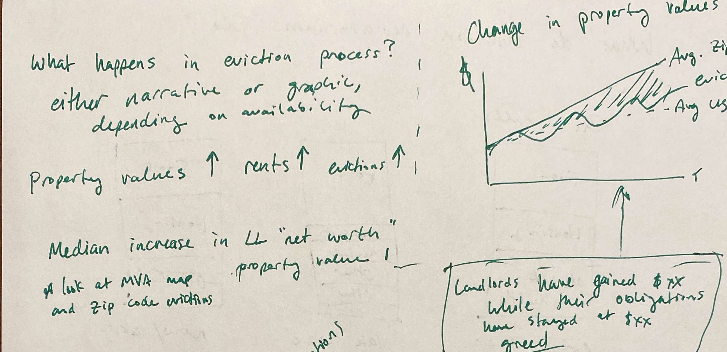 Then I will show the change in property values over time in Allegheny County zip codes that have a lot of evictions (I still need to figure out how I will define “a lot” by going through the data). The purpose of this chart will be to illustrate growth in property owner wealth, as rents increase even when properties don’t transact, and how it tracks with housing insecurity.

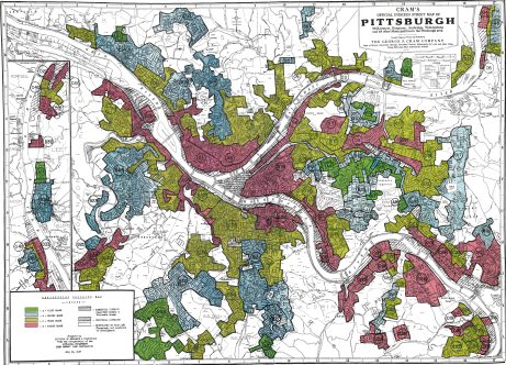
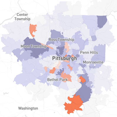
I will also show race and eviction, as well as a map of neighborhoods that have a lot of evictions alongside Pittsburgh’s original redlining map. This is not an original idea, as the right hand map is a screenshot from the Eviction Lab, but I will recreate this visual because I think it will be good, doable practice in GIS, and I think it could be really powerful storytelling if I critiqued it by design.
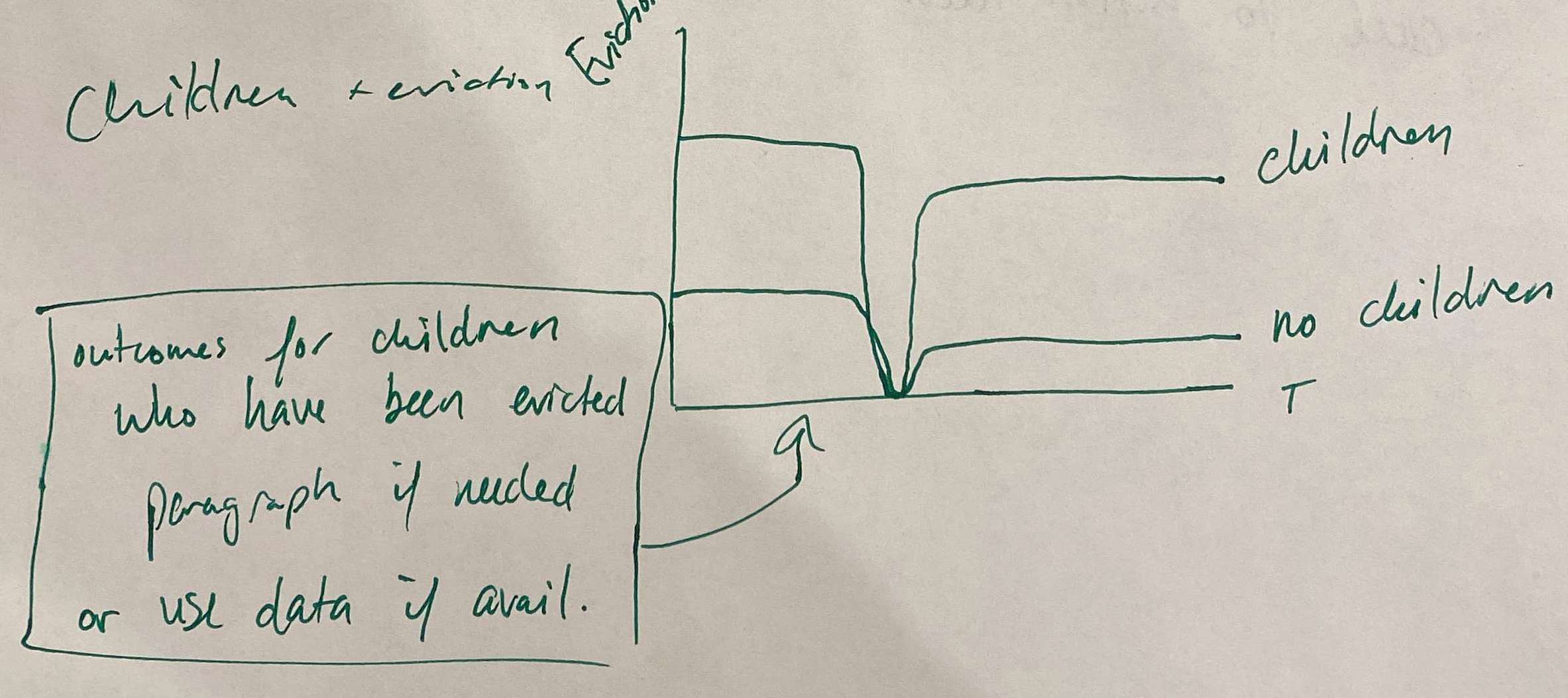 I’ll make another line chart to show evictions in areas that have a lot of children (same “a lot” caveat as above) and write a narrative about the impacts of eviction on children.
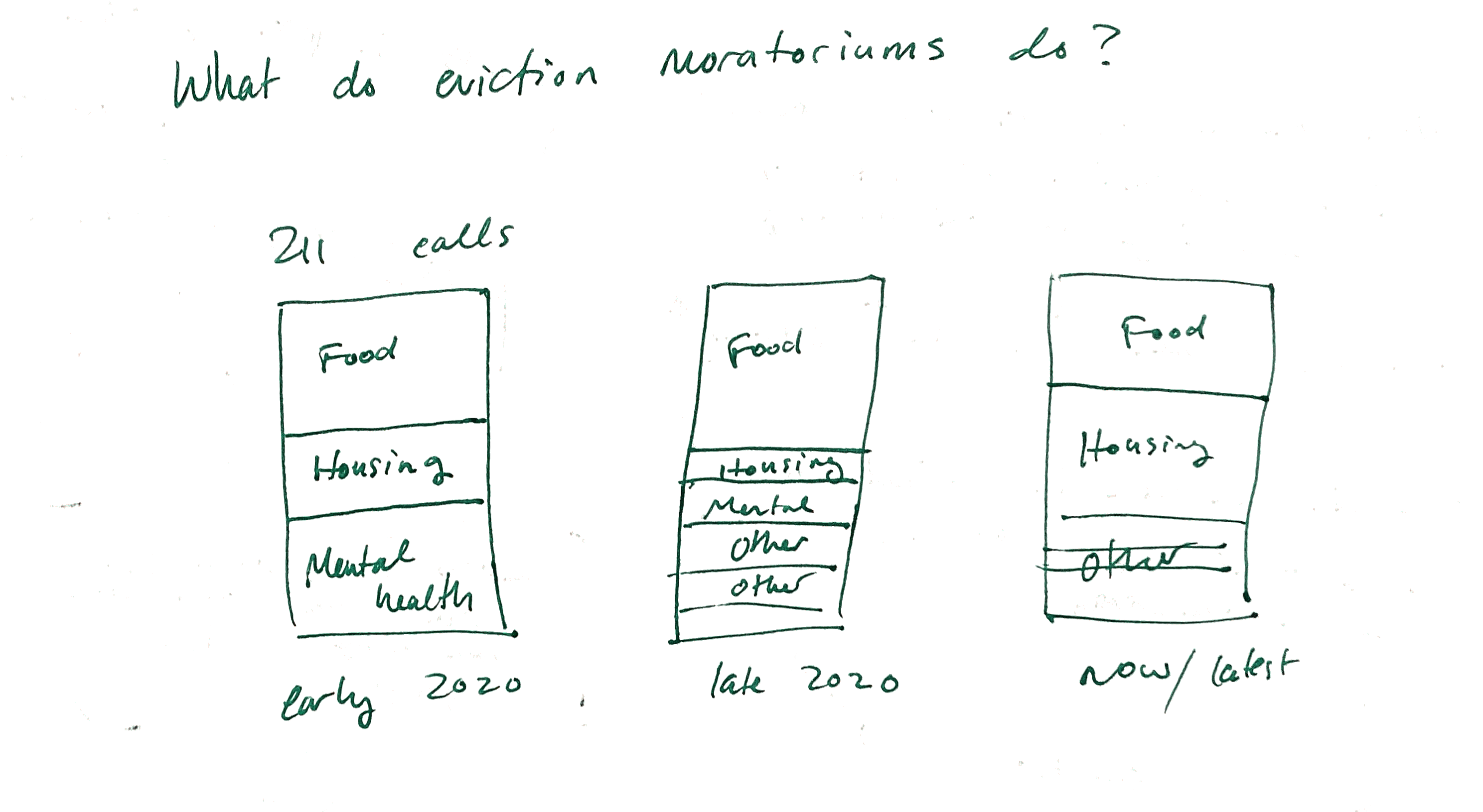 I will end the story with some stacked bars that show what happens when people aren’t getting evicted. I’ll use 211 call data to tell this part of the story, and the viewer will see the types of calls that occurred during the eviction moratorium.
The call to action will be to create a push for a comprehensive eviction diversion program, like the one that exists in Philadelphia, which requires landlords to participate in mediation before evicting their tenants.
data
-
Data about evictions in Allegheny County is collected by the CREATE Lab at CMU and is hosted by the Eviction Lab. They provide evictions by zip code and whether or not that zip code is majority Black for the last two years, and they provide averages based on the eviction data going back to 2012. It’s available here as a CSV.
1.5. I emailed the CREATE Lab to ask if I can have the data they used to calculate the averages because it goes back further, but even if they won’t send it to me, I will be able to make powerful visualizations. It will just mean that I will have to change one of my charts (about the presence of children) because census data about children is only available up to 2019, and the data I know I can use about evictions is only specific for 2020 and 2021.
-
Data about 211 calls in Allegheny County is hosted by the Western Pennsylvania Regional Data Center (WPRDC) and provided by the United Way of Southwestern PA. WPRDC also has Allegheny County property assessment data that includes the most recent sale price of each parcel in the county.
-
Data about the presence of children in a household and the racial makeup of a geography will come from the Census.
-
For the GIS visualization, a shapefile version of the 1937 Home Owners Loan Corp map of Pittsburgh, aka the redlining map, is available from WPRDC. Pennsylvania ZIP code shapefiles are available from PASDA.
method
I will make the project in Shorthand. It will be a website, with images filling the page and text appearing in boxes as the reader scrolls. I’ll make one of my visualizations in GIS, and I’ll try to push myself to use Tableau for the others. This would definitely be a great opportunity to practice! If after a while it seems like Tableau will be too hard, I will use Flourish instead. For cleaning and organizing the data to get it into Tableau, I’ll use Excel.
citations
I will use Zotero to keep track of the sources I use and to generate citations. Here’s one that I used in the intro:
Sturtevant, L., & Viveiros, J. (2016, January). How Investing in Housing Can Save on Health Care. https://www.tn.gov/content/dam/tn/health/program-areas/NHC_Invest_Housing_Save_Health_Care_2016.pdf