pascale-portfolio
HW assignment 2: critique by design
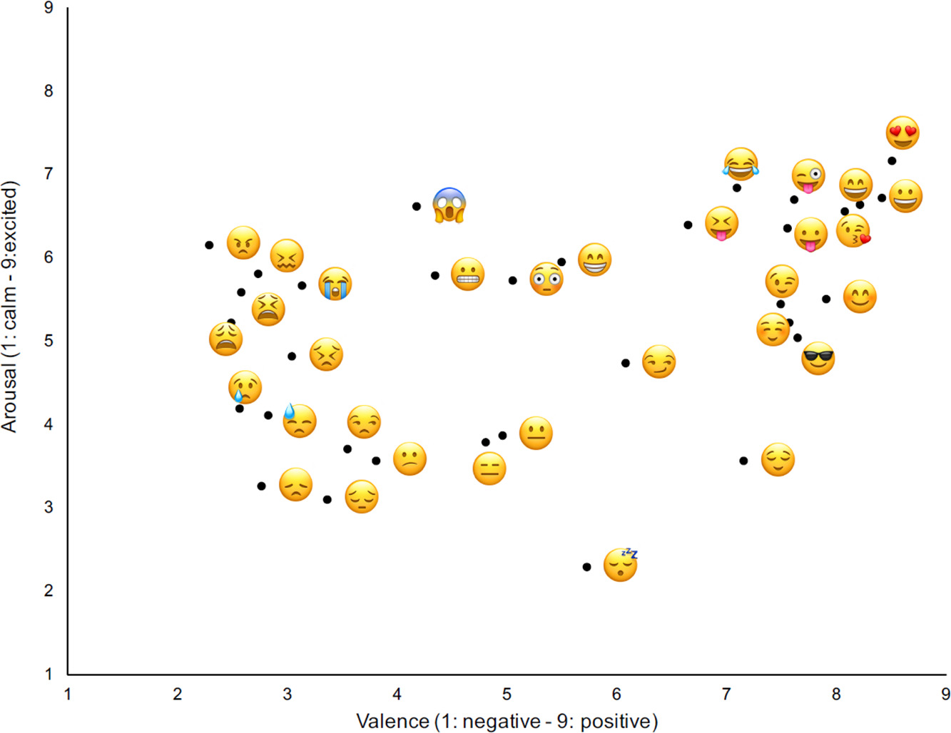
This assignment was to redesign a visualization to make it better. The visualization I chose was from this study about emoji. Here is the original visualization:
intro
The study surveyed 1000 Americans to learn what different emoji meant to them. They were then asked to score the emoji on “Arousal” and “Valence” - more on those words later. Here is another study that plots emoji along the same axes. To get some quick context for this type of visualization I read up about feelings categorizations. From the wikipedia page about Emotion Classification: “The Arousal-Nonarousal Scale measures how energized or soporific one feels. It is not the intensity of the emotion—for grief and depression can be low arousal intense feelings. While both anger and rage are unpleasant emotions, rage has a higher intensity or a higher arousal state. However boredom, which is also an unpleasant state, has a low arousal value.”
“Feelings wheels” and similar charts are commonly used to support people in expressing their moods as part of mental health mindfulness and treatment. Approaching emotions from a scientific perspective, and treating the experience of feeling a certain emotion with a student’s mind, is a component of mindfulness that can help people process and deal with unpleasant emotions. See also, this graph, a good example of an application of this model, which is from this Psychologist’s website:
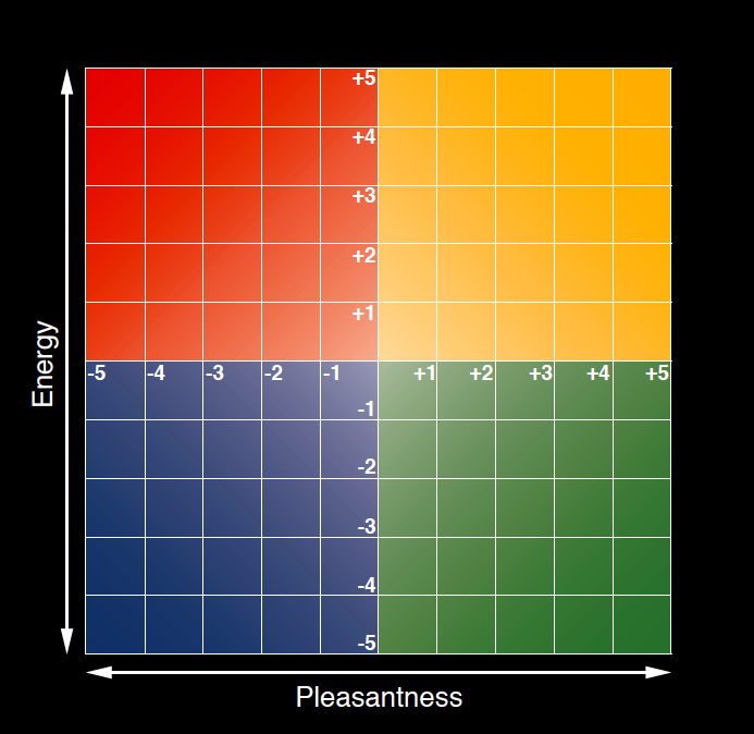 Source: Marc Brackett, PhD. https://www.marcbrackett.com/the-colors-of-our-emotions/
commentary on original visualization
Here is the original plot again:

After showing this visualization to 8 people, I can confidently say that the initial response to this visualization is to smile. I think from a design perspective that it’s convenient for a scatter plot that the emoji are already shaped like dots. They look particularly good placed directly on the axes. This is sort of a unique opportunity because the data visualization can contain the subject of the study itself - not even an image of the subject, because the subject is the image.
Something major that does not work is that the visualization doesn’t have a title, and the axes are confusing. If you’re not studying emotional categorization in an academic setting, you probably don’t know what “arousal” and “valence” mean - I certainly didn’t before starting to work on this chart. While it’s fun to look at, it’s very hard to know what exactly you’re supposed to be seeing. It raises more questions than it answers.
wireframes and feedback
I liked that this was a scatterplot for reasons discussed above. I decided early on that I was not going to have much luck trying different chart types. The next step was to make the best possible scatterplot out of these confusing data.
wireframe 1
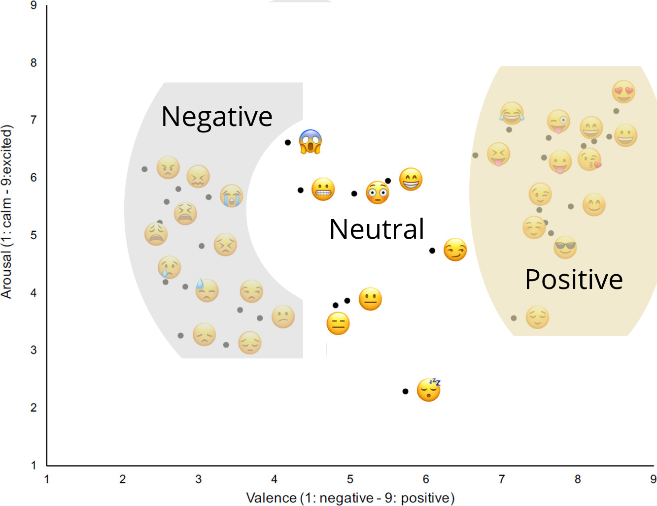
The first thing I wanted to try was tagging the emotions by their positivity. The study tagged these emoji into those categories in table form, so I only had to mark up the existing graph, which I did in Canva:
feedback on wireframe 1
“I am confused 😔 “
“The labeling of the axes is important - need better descriptors than valance and arousal. Simple “strength of emotion” and “positive/negative emotion” is clearer.”
“Do the emoji’s correspond with the dots? What’s valence, what’s arousal in regards to this? I am confused. Several of the neutral emojis don’t really seem very neutral to me.”
“This one is even more confusing because it doesn’t have the descriptors that show 1 is negative and 9 is positive and 1 is calm and 9 is excited. Also, wouldn’t a sleeping emoji be a 0 because being asleep is surely not being aroused at all, right? Why do axes both start at 1?”
“Rename the axes!”
wireframe 2
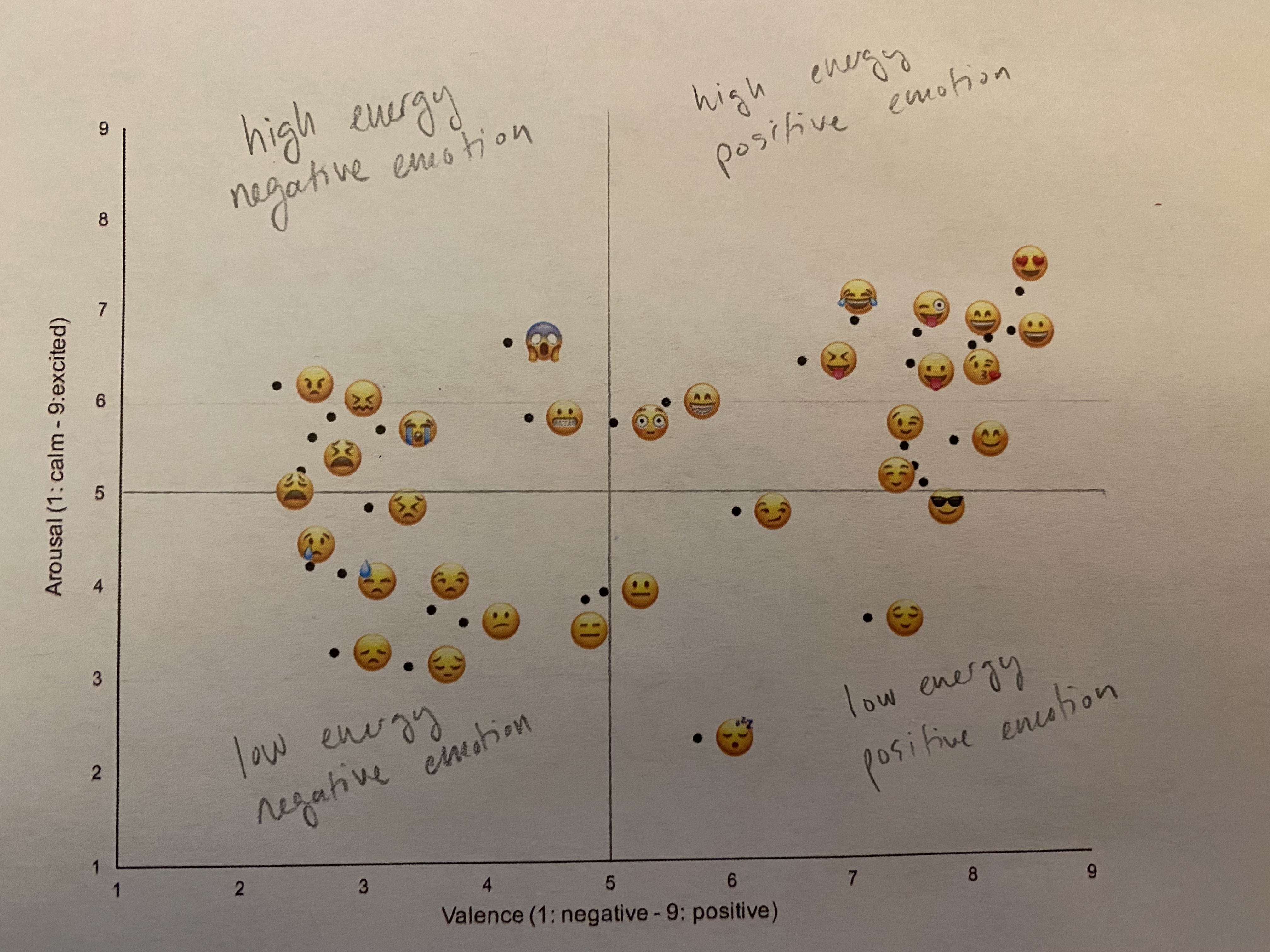
The second direction I went was to convert the graph into quadrants. With the way the scoring was set up in the study, one could say 5 on valence and 5 on arousal is “true neutral,” so even though the axes don’t go from -5 to 5, the shape still works:
feedback
“I think people generally understand the idea of the quadrants. And it works in this example since you have a good/bad binary on one axis. Better to have a binary on the other axis too- rather than just strength of emotion which is a continuum. I think you could arrange the positive/negative emotion on the x-axis and the strength on the y starting at the origin 0 as neutral and still come up with the quadrants. The further up and to the right the stronger and more positive.”
“Clarify what high energy means.”
wireframe 3 and 3.5
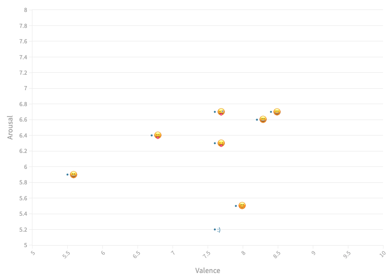
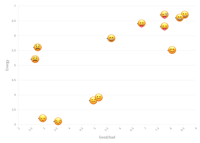
The next direction I went was to make a cut to look only at the similar emoji - those that I felt generally mean the same thing. I thought it might be interesting to see how the scores differed between emoji that look similar. What made people think one eye shape was more energetic than another eye shape? I also realized that I could make the emoji bigger, so I did. But to make the differences between the similar emoji clear, the axes needed to be really weird:
feedback
“Less emojis makes this easier to read/understand. Scales are even wonkier - why are we starting at 2 and 3, instead of 0? Still unclear on what energy means in regards to these emojis.”
wireframe 4
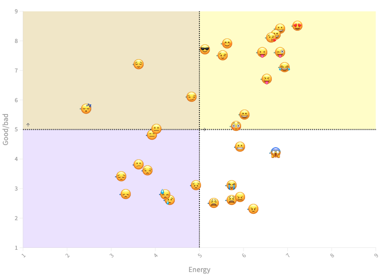
The next change to try was to add colors. Feelings charts usually do have colors. I’m not sure they are needed but I do think they look nice:
feedback
“I like this one!”
“This is confusing. What do the colors mean here? Based on the placement on the graph, I can guess that the lower numbers are bad and the higher numbers are good on the y-axis, but I still don’t really understand this.”
“lines that separate all 4 quadrants are misleading, I would think where the two lines intersect should be (0,0) but it corresponds with (5,5)”
“Can you try to add a visual indicator of variance? Maybe some arrows to indicate in what direction the variance is.”
“Do you have information about frequency of use?”
reflection on the feedback
People seemed to agree that the axis labels were really confusing. Here are some of the axis labels I tried:
good/bad | energy level
positivity | energy
positivity of feeling | no label for arousal
energy of feeling | no label for valence
pleasantness of feeling | energy of feeling
The title is another area to add value to this graph. Here are some of the titles I came up with:
“How do these emojis feel to you?”
“What feeling do these emoji bring up for people?”
“How Americans Scored Emoji Using the Arousal-Valence Model” <- this would work for the actual study graphic
“The relative pleasantness and energy levels of emoji”
“What feelings do emojis mean?”
final visualization
Ultimately, I chose to make the following changes:
- Allow the emoji to be their own dots on the scatterplot
- Add a title and subtitle to get the reader onboard
- Add a dropdown filter so the reader can choose to only see the most interesting emoji
- Change the axis titles to get away from academic language
- Modernize the font
- Add gridlines to create quadrants
- Annotate the quadrants to explain them at a glance